
Product
The state provides unemployment benefits to its citizens. For this the the citizens have to apply for benefits, provide required documentation and follow the instructions provided by their case worker. There are multiple types of benefits and based on eligibility, a citizen and their families can get the required help from the state.
Opportunity Statement
The existing web portal for unemployment benefits is only available to submit initial application from desktop. All further actions, need to be done by filing paper work with the case worker. There is an opportunity to improve this process with a mobile app. It will ease the benefits system for citizens and reduce the load on case worker.
My role
UX Designer
Project duration
7 months
Team
Design manager, Visual XD, Product manager, Developers
Collaborators
Social workers, Technology consultants
Impact
Many citizens used the newly launched mobile app to apply for benefits or used other features of the application.
Within first week of launch,
102
Citizens reported changes in their existing benefits using the application
69
Citizens updated their recertification forms using the application
27
Citizens submitted fresh benefit applications using the application
Process
The project focused mainly on the design phase as the requirements gathering and research was done by another team before the project was handed over to us.

Personas
Goal based personas were designed based on research, to understand different requirements of citizens and user journeys were designed for each one of them.

" I was recently laid off. So I need to get state benefits as soon as possible to support my child and pregnant wife."
Pains
-
Provide support and time required by his pregnant wife.
-
Take care and support his child’s education
-
Unsure about new job opportunitiesNeeds
Needs
-
Benefits approved as early as possible.
-
Different kinds of support system i.e. childcare, monetary support, job search, skill improvement etc.

" I want to add my son’s part time job in my family income to understand what benefits I will continue to receive. "
Pains
-
Difficult to update data on web as she doesn’t own a computer.
-
Unaware of income limits for being eligible for benefits.
Needs
-
Update family income and understand her eligibility for benefits.
-
Meet case worker to discuss her new family situation.

" My neighbour has agreed to help with my state benefits as I am a senior citizen. But I don’t know how it works. "
Pains
-
Newly diagnosed medical condition.
-
Lack of awareness about benefits at his age.
-
Asking neighbour’s help to proceed with benefits.
Needs
-
Understand various types of assistance for elderly.
-
Be able to designate someone as his representative.
-
Easy follow up and status updates.
Design principles
There were multiple issues raised by the customers. And these were validated by conducting a UX audit and having multiple stakeholder workshops. Key findings are highlighted below.
Design must...
Easy to understand
Many citizens might have less level of education. Hence, language of content must be written in 3rd grade English level as a benchmark to cater to every citizen in the state.
Minimal workflow
Current process is long and tiring which leads to information overload. Hence, each task flow must be evaluated for time required to complete the task and it’s cognitive load.
Simple interactions
Citizens might have small and low cost mobiles. Hence, interactions must be tap friendly and avoid gestures or other features which may not be available on some phones.
Design should...
Improved communication
Currently, there is a lack of communication between case workers and citizen. Hence,app should provide scope for this as it will make the citizen feel safe and comfortable with the process.
Additional information
Problem of lack of awareness about benefits is high. Hence, app should explicitly mention all the possible benefits an individual citizen and their family are eligible for based on their situation.
Low tech compatible
Citizens might have small and low cost mobiles. Hence, interactions must be tap friendly and avoid gestures or other features which may not be available on some phones.
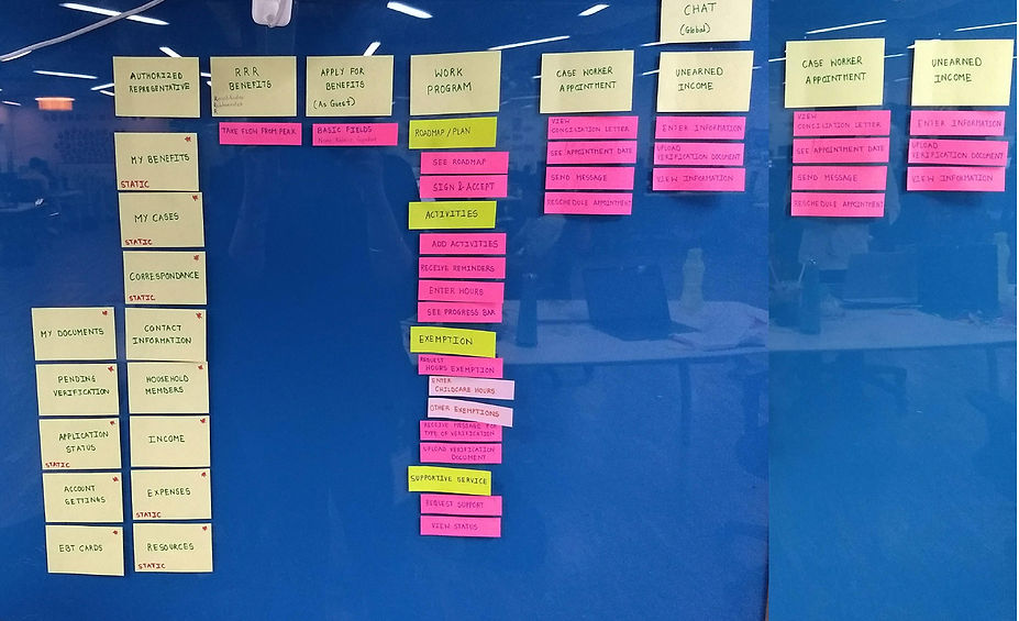
Sitemap
This is the first version of site map which further evolved with time based on feedback from stakeholder discussions.
Whiteboarding
All the elements within each flow were categorised based on user actions, read, sign, select, fill etc. and then appropriately added to the sketches.

Wireframing
Ideas from the wire framing activity were further converted into high fidelity wireframes for individual workflows.

Final designs
Final designs were done based on the finalised workflows and the screens were designed based on the components from the design system and the visual styling defined by the visual designer.

Component library
All the components were designed based on atomic design approach. Each component was well documented for ease of communication with the developers and the designers.
Alert card

Dropdown field
